Choose a different draw.io editor theme
You can customise the draw.io editor and choose your preferred theme for the user interface. The editor theme controls which editor elements are displayed, minimised or hidden in the user interface, including the menu, toolbar, panels and dialog boxes.
There are several different editor themes to choose from which work in both dark and light modes.
Change the editor theme via the draw.io menu
- Open the draw.io menu and select Settings > Theme.
- In the Simple editor theme, click on the three dots in the toolbar.
- In the Sketch editor theme, click on the three horizontal lines in the top left.
- In the Minimal editor theme, click on Diagram in the top left.
- In the Atlas and Classic editor themes, click on Extras > Theme
- Choose between Classic, Simple, Minimal, Sketch (a whiteboard-style theme), or Atlas.
- If prompted, reload the draw.io editor to start using your selected editor theme.
Please visit GitHub to leave feedback about the Sketch and Minimal editor themes and help guide their development.
Tip: If you are new to diagramming, read the introduction to the draw.io editor that looks at all the various important elements.
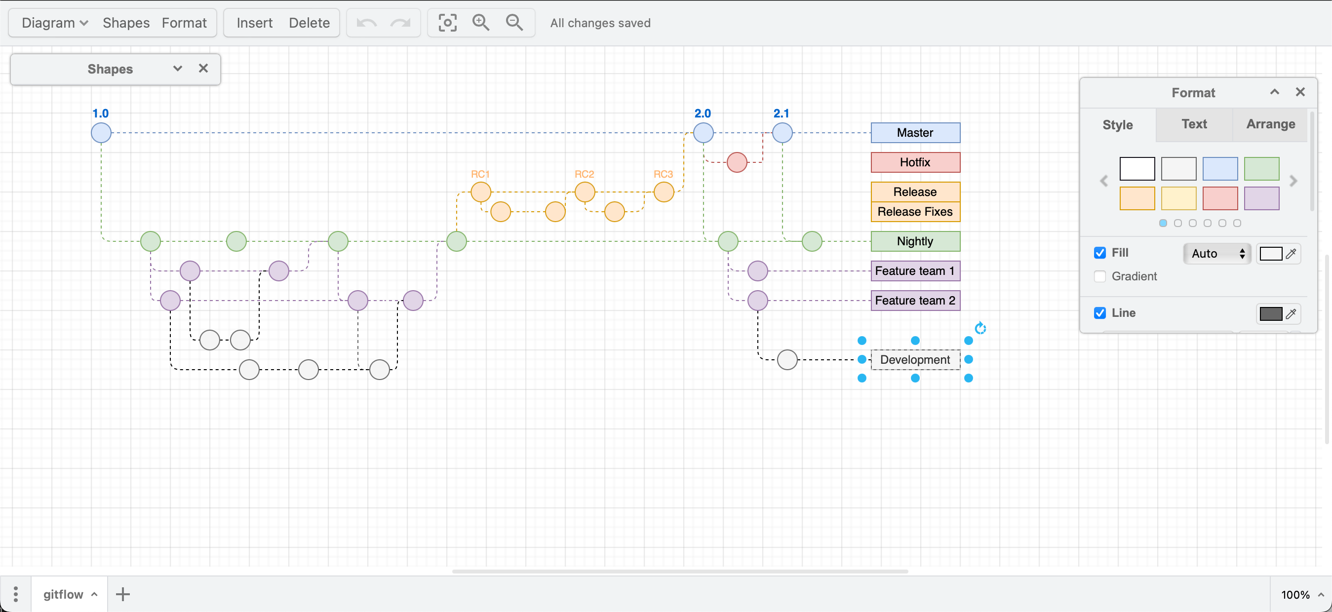
The new Simple editor theme has a streamlined toolbar and minimisable panels for a larger drawing canvas.
Classic
The Classic editor theme (previously the Kennedy theme), named after the Google UI, is the default style for draw.io, and shows the menu, toolbar, file name, language selector, fixed panels either side and diagram pages below the drawing canvas.
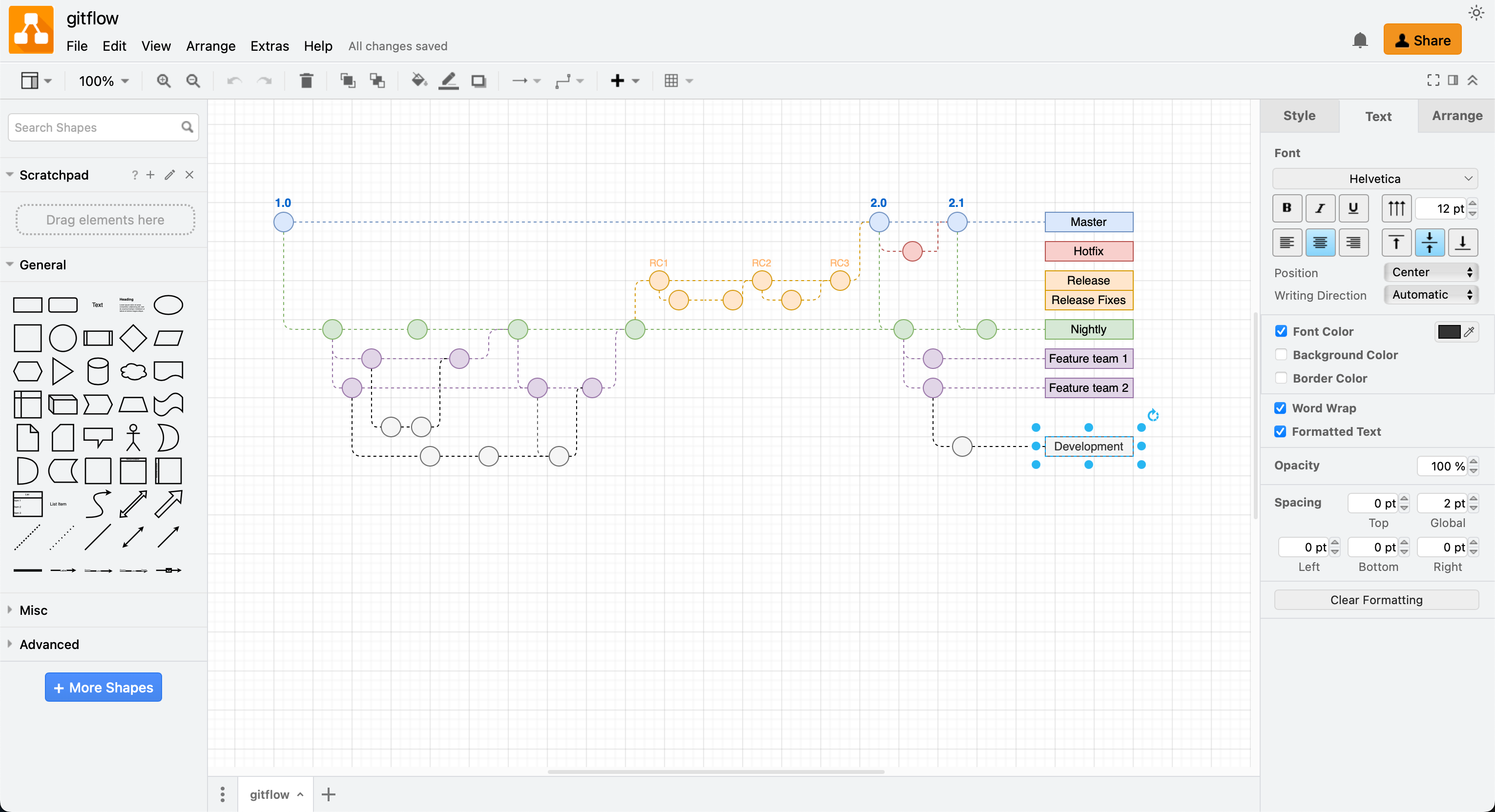
Start using the draw.io editor with the Classic theme
Atlas
If you are used to using the draw.io apps on Atlassian Confluence or Jira, use the Atlas theme if you prefer to keep using that interface in the online draw.io editor or in draw.io Desktop.
The Atlas UI theme does not show the diagram’s filename or the Share button, but the rest of the editor elements are displayed in roughly the same positions.
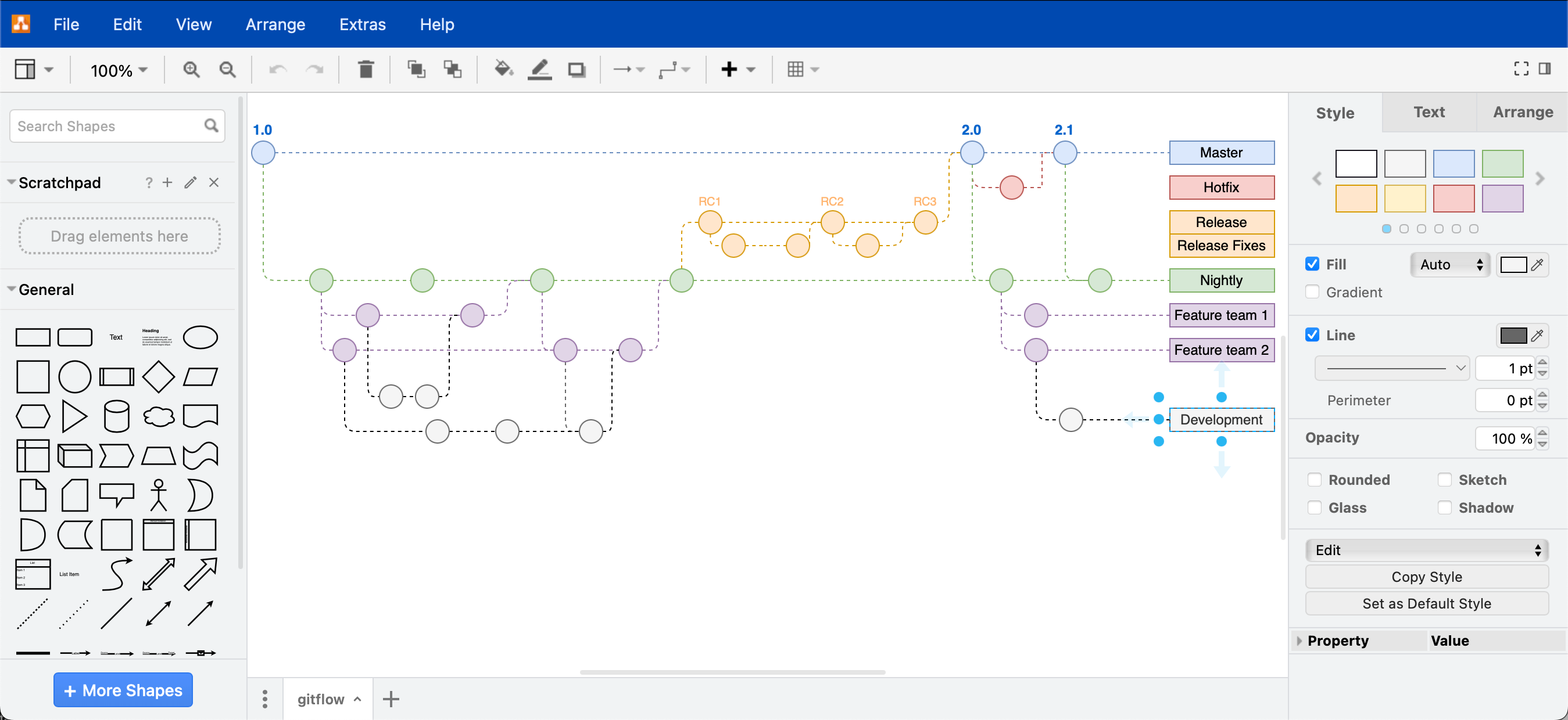
Start using the draw.io editor with the Atlas theme
Minimal
If you are diagramming on a tablet or a mobile device, the Minimal theme allows you to collapse the panels around the drawing canvas for less ‘clutter’. The Minimal theme, or the Sketch (whiteboard) editor theme below are ideal for remote kanban boards
When using the Minimal theme
- The menu is minimised to the Diagram tool on the toolbar, panels can be toggled on and off as you need, or minimised to their titles to make room for more drawing.
- The panels are floating in the Minimal theme, you can drag them to a new position over the drawing canvas.
- Select Diagram > Preferences > Theme when using the Minimal editor theme to change to another one, then refresh the page.
If you are new to diagramming and feel overwhelmed with the number of tools displayed in a diagram editor, you may find the Minimal theme easier to use.

Start using the draw.io editor with the Minimal theme
Sketch
If you prefer minimal tools and the rough style enabled by default, like you would in a whiteboarding app, the Sketch editor theme is for you. This easy-to-use theme is set by default in the draw.io Board macro for Confluence, and in the draw.io for Notion Chrome extension.
The Sketch editor theme may also be useful to introduce younger children to diagramming or support them as they add diagrams to their documents and in Google Classroom with the Google Drive add-in.
Enable the Sketch editor theme in draw.io as you would any other theme and refresh the page. Alternatively, go to sketch.diagrams.net
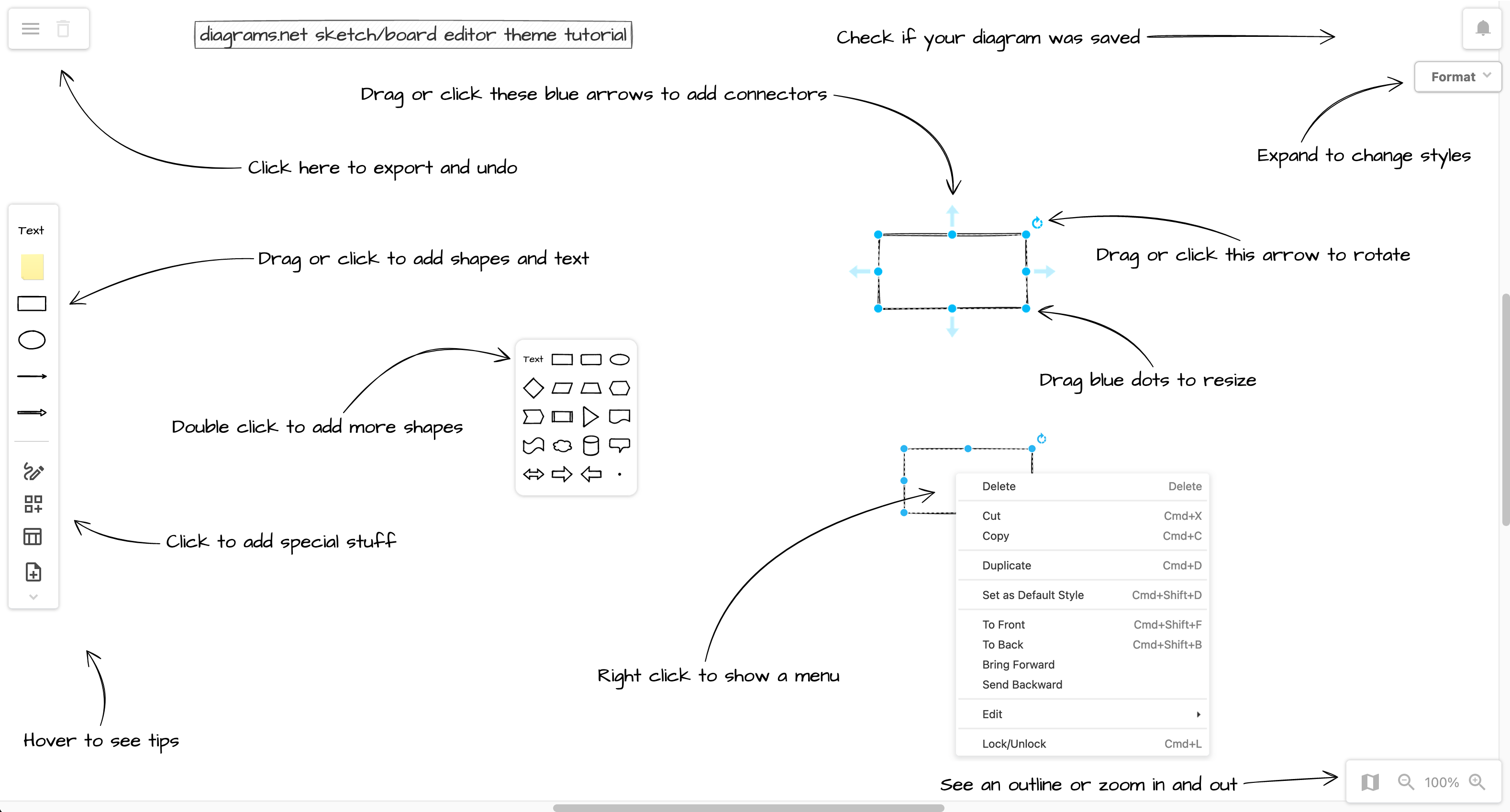
Open this tutorial in the new Sketch theme at diagrams.net
Tip: Resize your browser to line everything up with the tutorial.
Editor theme + Dark mode
If you prefer to work on a dark background with light outlines and text, or if you are creating an infographic that will be printed on a dark background, switch to dark mode in whatever editor theme you are currently using.
Select Extras > Appearance > Dark if you are using the Classic or Atlas editor themes.
In all other themes, open the draw.io menu and select Settings > Appearance > Dark.
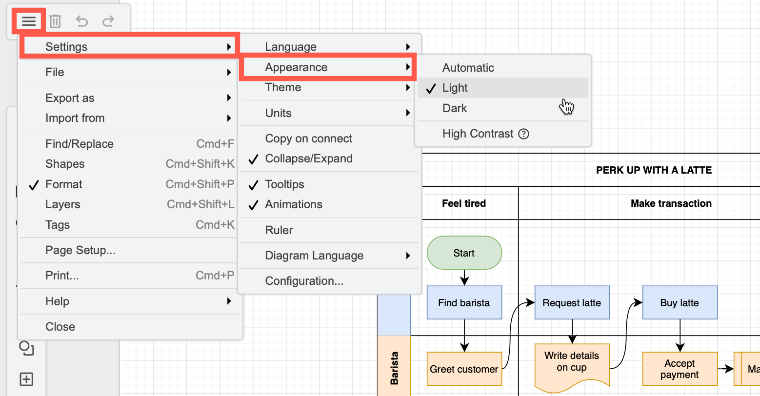
Start using the draw.io editor in Dark mode
Automatic will automatically match your browser or operating system’s dark mode settings.
When using the Dark theme
- Adaptive colours for shared diagrams: Colours will automatically adapt to whoever is viewing or editing your diagram, ensuring it remains readable in both dark and light mde. Learn more about adaptive colours
- Exporting diagrams: Set the background of your diagram to transparent before you export it to a PDF or image format, or choose to export it with a dark background (as if it were in dark mode).